
A shopper can be ready to buy and still leave when delivery costs appear late, a form rejects a valid address, or a payment error gives no clear next step. Checkout optimization is the work of finding and removing those avoidable obstacles while preserving the information and safeguards a business needs to complete an order.
For ecommerce owners and growth teams, the practical starting point is to review the complete journey from cart to confirmation, identify where customers hesitate or fail, and test a small number of evidence-based changes. A shorter checkout is not automatically a better checkout; clarity, recovery, trust, and reliable order handling matter just as much.
Ecommerce Checkout Optimization Checklist
- Show the order contents, delivery options, taxes, discounts, and total before the final payment action.
- Make guest checkout easy to find when account creation is optional.
- Ask only for information needed to fulfill, support, or legally process the order.
- Use clear field labels, suitable mobile keyboards, and specific errors that preserve what the shopper entered.
- Explain payment choices, delivery timing, return terms, and any handoff to a third-party provider.
- Test the full flow on common devices, browsers, payment methods, and failure paths.
- Measure each checkout step and order outcome before and after a change.
Growing an ecommerce business?
Choose the next improvement that moves revenue.
Get help with platform decisions, store UX, performance, content, and conversion-focused ecommerce strategy.
Start by Finding Where Shoppers Get Stuck
Begin with the funnel your analytics platform can reliably measure: cart, checkout start, shipping details, delivery choice, payment, and order confirmation. Define each event consistently and compare like-for-like periods, devices, traffic sources, and order types. A large exit rate at one step is a signal to investigate, not proof of a single cause.
Pair funnel data with direct observation. Review customer support messages, payment-provider outcomes, session recordings where consent and privacy rules allow them, and moderated usability sessions. Reproduce the flow yourself with representative products, addresses, promotions, shipping zones, and payment methods. Record what happened, the device and browser, and whether the issue is repeatable.
Separate customer decisions from technical failures. A shopper may leave because delivery is unsuitable, while a failed redirect, unavailable method, or confusing validation message can prevent someone who intended to buy. Those problems need different remedies and different owners.
Make the Order and Its Total Easy to Understand
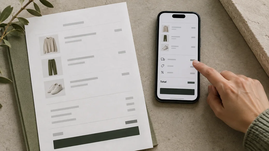
Unexpected costs and unclear delivery terms create avoidable doubt. Show shipping choices and their expected timing as early as the store can calculate them. Make taxes, discounts, fees, and the final amount visible before the shopper commits to payment. If an exact cost depends on an address, explain that dependency and show when the estimate will become final.
Keep the order summary available on small screens without obscuring the form or the main action. Let shoppers check product, quantity, size or other selected options, and delivery details. If they edit a cart item, return them to checkout without losing unrelated information.
Do not hide important terms in dense legal copy or rely on vague reassurance. State relevant return, delivery, and payment conditions in plain language near the decision they affect. The appropriate detail depends on the store’s actual policies, so keep checkout messaging aligned with operations.
Reduce Form Work Without Removing Useful Safeguards
Review each field and ask what decision or task depends on it. Remove fields that have no clear operational, customer-service, or legal purpose. Mark optional information as optional, make required fields obvious, and avoid asking shoppers to enter the same detail more than once when it can be safely reused.
Use labels that remain visible while a field is filled. Choose input types and autocomplete hints that suit the information, and test the on-screen keyboard on mobile. Let customers correct mistakes without erasing the rest of the form. When validation fails, identify the field and explain how to fix it in language that does not expose sensitive information.
Guest checkout can reduce pressure to register, but the option needs to be visible and clearly named. If account creation helps returning customers, offer it at a sensible point and explain its benefit. Do not make a password or account step appear unexpectedly after a shopper has started a guest path.
Baymard Institute’s checkout research discusses guest checkout visibility, form field usability, and error recovery as recurring usability concerns. Treat published examples as prompts for reviewing your own customers and store rather than universal proof that one interface will suit every business. See its checkout flow UX guide for further research context.
Design for Mobile, Accessibility, and Payment Confidence
Test checkout with real viewport sizes, touch input, browser zoom, and assistive technology where possible. Keep controls large enough to operate, make focus visible, associate labels and errors with their fields, and ensure the order of keyboard navigation follows the visible flow. Check that sticky summaries and consent panels do not cover the next action.
Present available payment methods clearly and make the selected option understandable. Explain when a payment provider opens a new page or verification step, and provide a reliable path back to the order. Do not suggest that a payment succeeded until the store has confirmation from its payment and order systems.
Use only the trust details that are accurate for the business: recognizable payment methods, a working contact route, and clear fulfillment and return information can answer real questions. Avoid decorative security badges or guarantees that the store cannot substantiate.
Make Errors Recoverable and Keep Orders in Sync
Exercise more than the happy path. Test declined payments, interrupted authentication, expired sessions, network delays, invalid promotion codes, unavailable shipping choices, and duplicate clicks on the final action. The customer should receive a useful status and a next step, and the store should avoid creating duplicate or ambiguous orders.
Keep entered information when a recoverable error occurs, subject to security and privacy requirements. Distinguish an authorization that failed from a transaction whose result is still unknown. Provide a safe retry or a way to contact support when automatic recovery is not appropriate.
After payment, check that confirmation, order status, inventory, emails, and fulfillment systems agree. Reconcile test orders across the storefront and connected providers. A smooth interface still fails the customer if it produces an unclear confirmation or an order that the operations team cannot fulfill.

Prioritize Changes and Measure Their Effects
Write each finding as an observed problem, affected step, evidence, likely customer consequence, and proposed owner. Rank clear blockers and repeated failures before visual refinements. Estimate the implementation effort and note dependencies such as payment-provider settings, shipping rules, theme changes, analytics, or legal review.
Change one meaningful part of the journey at a time when practical. Define the primary measure before release, such as successful progression to the next checkout step or completed orders among eligible checkout starts. Also monitor guardrails: payment failures, duplicate orders, support contacts, refunds, delivery selection, and total order value where appropriate. Interpret results in context; small samples, seasonal demand, and traffic mix can make a short comparison misleading.
Retest the change across representative devices and order scenarios before rollout. After release, confirm that analytics still records the steps correctly and that payment and fulfillment behavior remains sound. Keep a record of what changed so later comparisons have a clear reference.
Common Checkout Optimization Mistakes
- Removing steps by assumption. Some steps explain a necessary choice. Simplify only after confirming the information is not needed elsewhere.
- Changing several things at once. A bundle of unrelated edits makes it harder to learn which change helped or created a problem.
- Optimizing only for desktop. Review real mobile flows, keyboards, focus order, overlays, and error recovery.
- Adding urgency or trust claims without evidence. Keep checkout copy consistent with actual inventory, delivery, and business policies.
- Testing only successful payments. Declines, interruptions, delayed responses, and retries are part of the customer journey.
- Using checkout completion as the only guardrail. Confirm order accuracy, payment reconciliation, customer support load, and fulfillment outcomes too.
When to Get Checkout UX Support
Bring in experienced UX and development support when the checkout problem crosses theme, platform, payment, shipping, analytics, and operations ownership, or when repeated fixes have not resolved a clearly observed issue. A focused review should deliver evidence, prioritized recommendations, and a validation plan that your team can act on.
Zeroradius provides UI/UX design services for improving digital experiences and ecommerce website development for stores that need implementation support. If checkout friction is part of a wider site experience problem, our UX audit service can help structure the review.
Ask Zeroradius to audit your checkout journey and map the highest-priority usability and implementation issues to a practical improvement plan.
Have questions?
It is the process of identifying and reducing avoidable friction between cart and confirmed order while preserving clear choices, accurate payment handling, and necessary business information.
Investigate repeatable failures that prevent customers from continuing, such as payment errors, broken shipping choices, confusing totals, or form validation that blocks a valid order. Confirm the cause with funnel data and direct testing before choosing a fix.
No. Removing an unnecessary field or decision may help, but a shorter flow can still be confusing or omit information customers need. Optimize clarity, effort, recovery, and successful order handling together.
When account creation is not required to fulfill the order, a visible guest path gives customers a choice. If registration is necessary for a specific business model, explain why before asking shoppers to proceed.
Track progression and completed orders across defined checkout steps, then monitor guardrails such as payment failures, duplicate orders, support contacts, and fulfillment accuracy. Compare similar periods and traffic segments, and check that event tracking works after release.
Test after meaningful changes to the theme, platform, payment provider, shipping rules, or connected apps, and investigate when support reports or funnel data show a new issue. The right cadence depends on how often the store changes and how complex its checkout is.