A website redesign can stall over a question that should have been answered before the first homepage concept: what should this business stand for? When the audience, message, and visual identity are still being debated, each design review becomes another brand workshop.
Before a website redesign, approve your target audience, positioning, core message, logo system, colors, typography, image direction, and the person responsible for final decisions. Put those decisions and usable files in one shared brand brief so the website team can design against agreed requirements.
This brand identity checklist is for business owners and marketing leads preparing to brief a redesign agency or internal team. It helps you decide what to keep, what to resolve, and what to hand over before detailed page design begins.
Quick Brand Identity Checklist Before a Website Redesign
- Audience: name the primary customer and the decision the website should help them make.
- Positioning: explain what you offer, why it matters, and what makes the choice credible.
- Messaging: approve the business description, service names, tone, and key claims.
- Visual identity: collect approved logos, usable color combinations, type rules, and image examples.
- Real-page fit: test the identity on a representative desktop and mobile page.
- Asset readiness: identify source files, web exports, usage permissions, and missing content.
- Approval: assign a decision-maker, review stages, and owners for unresolved items.
- Rollout: list the other customer touchpoints that need the same identity update.
Mark each item as ready, needs a decision, or missing. Add an owner and due date to anything unresolved. This is a preparation checklist, not a numerical score: an undecided business name can block the project even if every image file is ready.
Want a clearer user experience?
Improve the parts of your website users actually feel.
Get support with UX clarity, conversion flow, interface design, and website structure tailored to your goals.
1. Agree on the Audience and Brand Direction
Define who the redesigned website must serve
“Businesses of all sizes” is rarely specific enough to guide a homepage. Describe the primary buyer, their problem, their main concern, and the next action they should take. Separate that audience from secondary visitors such as job applicants, partners, or existing customers seeking support.
For example, a commercial interiors company might prioritize office managers comparing refurbishment partners. Its website would need to explain project scope, working arrangements, and relevant experience before asking for an enquiry. This is an illustrative planning example, not a Zeroradius client case study.
Write a positioning statement your team can use
Complete this sentence in plain language: “We help [specific audience] solve [problem] through [offer], supported by [credible evidence].” Treat it as an internal decision tool; it does not have to become the homepage headline.
Use customer questions, sales conversations, and existing research to check the statement. If leaders disagree about the offer or target customer, resolve that disagreement through brand strategy before asking designers to express it visually.
Decide what stays and what changes
Review the current name, logo, colors, service language, and recognizable imagery. Record what customers already associate with the business and why each proposed change is necessary. A website redesign does not automatically require a new identity.
Keep effective brand elements when the main problems are navigation, page structure, or usability. If you are unsure whether the website itself needs rebuilding, review the warning signs that justify a UX audit before expanding the scope.
2. Approve Messaging Before Polishing Page Layouts
Brand identity includes how the business sounds as well as how it looks. Prepare enough real copy to reveal whether the message is clear; placeholder headlines cannot test the length or complexity of your actual offer.
- Business description: a short explanation of who you help and what you do.
- Offer structure: approved service or product names and the differences between them.
- Value proposition: the practical reason a suitable customer should consider you.
- Proof: verified project examples, testimonials, credentials, or process details you can publish.
- Voice: a few writing principles with examples of wording to use and avoid.
- Next steps: action labels that accurately describe what happens after a click.
For instance, “Request a project estimate” sets a different expectation from “Book a consultation.” Choose the label that matches the actual process. Avoid presenting an enquiry form as an instant booking if someone must arrange the appointment later.
Give broad tone words a practical meaning. Instead of only saying “professional and approachable,” specify “explain specialist terms, use direct sentences, and avoid claims we cannot demonstrate.” Assign someone to verify claims and approve evidence before publication.
3. Check That the Visual Identity Works on a Website
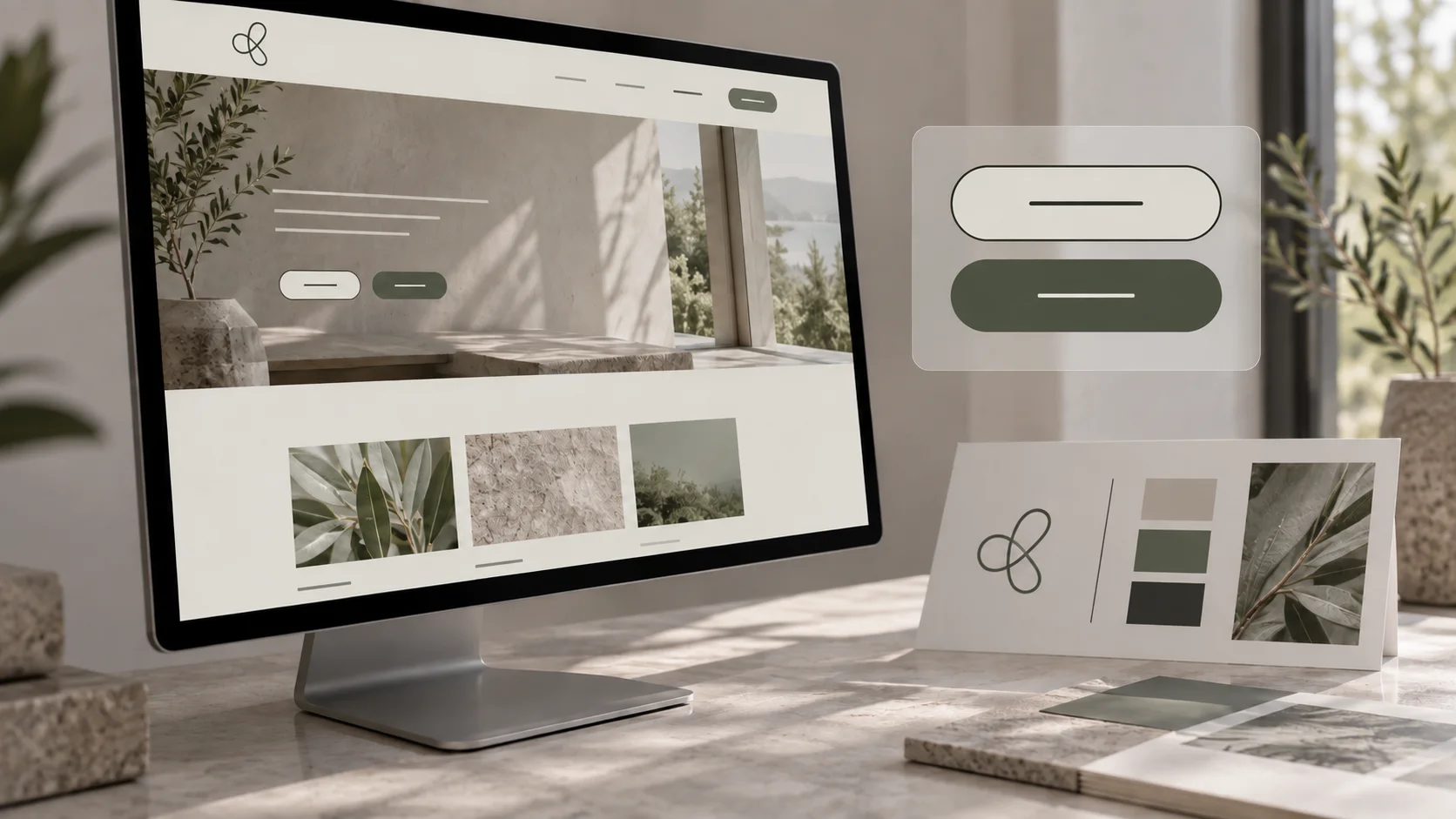
Logo files and variations
Provide the approved master artwork and web-ready versions, not just a logo copied from a presentation. Include suitable variations for light and dark backgrounds, a compact mark where one exists, and guidance on spacing and minimum usable size.
Check the logo in a narrow mobile header, the footer, and a small browser icon. If fine details disappear, ask the identity designer for an approved small-format treatment. Do not let each developer or supplier improvise a different version.
Colors with defined roles
A palette should explain which colors are used for backgrounds, body text, links, primary actions, and supporting accents. Test the combinations on actual content rather than approving isolated swatches.
For ordinary text, WCAG 2.2 Level AA specifies a minimum contrast ratio of 4.5:1, with 3:1 for qualifying large text and defined exceptions. The W3C explanation of text contrast clarifies that the logo exception does not exempt the wider brand palette. Ask the design team to document usable text and background pairings; a contrast check alone is not a complete accessibility review.
Typography for real content
Confirm the heading and body typefaces, available weights, fallback fonts, and webfont usage permissions. Check numerals, punctuation, longer service names, and any languages the site must support.
Review a full paragraph and a small-screen page, not only a large sample word. Discuss font delivery with the developer so the visual direction can be implemented without unnecessary font files or a layout that depends on one perfect line break.
Photography, icons, and supporting graphics
Define the subject matter, lighting, crop style, and tone of imagery. A useful direction might be “real teams working on relevant projects, natural light, uncluttered backgrounds” rather than “premium photos.” Include examples and explain why they fit.
List the images needed for priority pages and identify what must be photographed, commissioned, or sourced. Keep icon styles consistent and record where image usage permissions are stored. Do not use generic imagery as proof of facilities, staff, or work the business does not actually have.
4. Test the Brand on a Representative Customer Journey
Before rolling the identity across every page, apply it to a small but meaningful sample: a homepage introduction, a service or product page, and the enquiry or purchase step. Include mobile layouts and real copy.
Ask reviewers to check whether a visitor can understand the offer, distinguish the main action, read supporting information, and recognize the same business throughout. Inspect form labels, error messages, and confirmation wording as well as the headline and hero image.
Use this review to find gaps in the brand rules. Perhaps an accent color works in a logo but not behind button text, or a heading font becomes difficult to read in long service titles. Resolve those application details before approving a full set of page designs. Zeroradius's UI/UX design service connects visual design with interface structure and customer journeys.
5. Prepare the Brand Handoff and Approval Plan
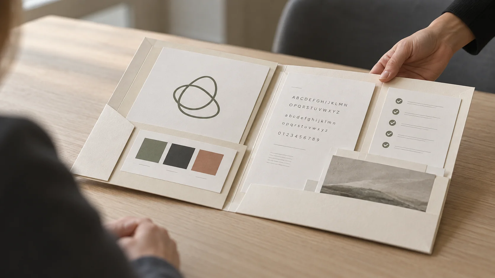
Create one shared source of approved assets. Use clear filenames and version dates, archive superseded files separately, and make sure the website team can access the source material they need.
What to give your website designer
- A short brand brief covering the audience, positioning, project goals, and elements to retain.
- Approved logo files, variations, color values, typography rules, and relevant permissions.
- Image direction, available photography, icon guidance, and a list of assets still needed.
- Core messaging, priority-page copy, evidence for claims, and preferred action labels.
- Examples of the identity applied to representative desktop and mobile content.
- A decision log, named approver, and owners and deadlines for outstanding items.
If the identity already exists but its rules live in scattered files and individual memory, brand guidelines can turn those decisions into a practical reference for designers, developers, and future content editors.
Set review stages and rollout responsibilities
Agree who gathers feedback and who makes the final decision. Review brand direction first, representative applications next, and page details afterward. Ask reviewers to relate feedback to the audience and brief instead of introducing a new personal preference at every stage.
Also list the customer touchpoints affected by a change: proposals, email signatures, social profiles, downloadable documents, and transactional messages. Assign owners and a rollout sequence so the new website is supported by consistent material elsewhere.
Common Brand Preparation Mistakes
- Approving the logo and calling the identity finished: the website still needs typography, messaging, imagery, and application rules.
- Using a moodboard as a specification: attractive references need a clear explanation of what to adopt and why.
- Copying a competitor's visual style: begin with your audience, offer, and evidence instead of someone else's presentation.
- Testing only the homepage: dense information, forms, and mobile layouts often reveal missing rules.
- Leaving assets until development: missing artwork, permissions, or photography can force late substitutions.
- Inviting unlimited late feedback: document approved decisions and assess later changes against time and scope.
You do not need an elaborate brand book to start a small redesign. You do need enough agreed direction and usable material to prevent the team from making foundational decisions repeatedly.
Make Your Brand Ready for the Redesign
Use the checklist to hold a focused preparation review. Resolve the audience, message, and core visual system first; give every remaining asset or decision an owner. The result should be a brief your website team can apply, not just a collection of inspiration.
Bring your current website, logo files, and checklist gaps to Zeroradius. Discuss your brand identity design requirements to define the visual direction, supporting elements, and guidelines your redesign needs.
Have questions?
Prepare approved logo files, color and typography rules, image direction, core messaging, and relevant usage permissions. Include a short audience and positioning brief, priority-page content, and a named approver. Document missing assets with owners and deadlines.
No. If the existing identity still fits your audience and business, retain it and improve how the website applies it. Review the brand first when positioning has changed, messaging is inconsistent, or the visual system cannot support the required pages.
No. A logo does not define the message, page hierarchy, type system, image style, or interface colors. Add practical usage rules and real content examples so the designer can build a consistent experience.
Yes, with clear dependencies. Research and content planning can overlap with brand work, but approve the core positioning and visual direction before committing to detailed page designs. Agree how later brand changes will affect the schedule and scope.
Assign one accountable business or marketing decision-maker to consolidate input. Involve the people responsible for sales, content, design, and development where their expertise is relevant, while keeping final approval responsibility explicit.
The team should agree on the audience and offer, have usable approved assets, and be able to apply the identity to representative desktop and mobile content. Any remaining gaps should have an owner and a plan that does not block the next design stage.