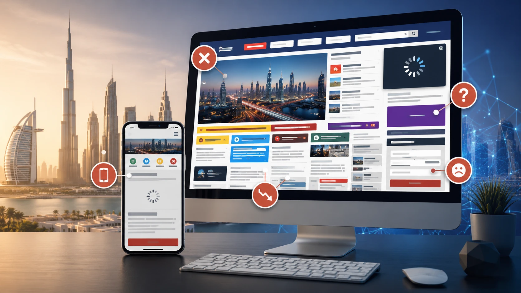
Your website looks finished, but customers still call to ask where something is, abandon enquiry forms, or struggle to complete a purchase. Before paying for another redesign, find out which part of the experience is failing them.
Your website needs a UX audit when important customer tasks are repeatedly difficult, business results have weakened without a clear explanation, or you need evidence before making substantial design changes. A UX audit is a structured review of how easily people can understand your website, find what they need, and complete a useful action.
This guide is for business owners deciding whether to commission an audit of an existing website. It explains the warning signs, the evidence to gather, and how to turn findings into practical fixes without assuming every problem needs a rebuild.
Quick Checklist: Is It Time for a UX Audit?
- Customers repeatedly ask questions that the website should answer.
- People start important tasks but struggle to finish them.
- Mobile visitors encounter problems that desktop checks miss.
- New pages, services, or features have made navigation confusing.
- Your team disagrees about what to change and lacks user evidence.
- You are planning a redesign or campaign and need to identify existing obstacles.
Use these signals to choose an investigation, not to calculate a universal score. One reproducible blocker in a critical journey deserves attention. An isolated change in an analytics metric needs context before it becomes a design brief.
Want a clearer user experience?
Improve the parts of your website users actually feel.
Get support with UX clarity, conversion flow, interface design, and website structure tailored to your goals.
Warning Signs Your Website Needs a UX Audit
1. Traffic Arrives, but Important Actions Stall
If relevant visitors reach a service page but few start an enquiry, investigate whether they can understand the offer, judge its suitability, and find the next step. If they start a form but rarely complete it, inspect that form and the submission process.
First check that measurement works. A missing confirmation event can look like a conversion problem. Compare similar traffic sources, devices, and periods, and check whether campaign targeting or the offer changed. Our guide to why a website gets traffic but no leads explores the wider diagnosis.
2. Customers Need Help with Basic Website Tasks
Repeated questions such as “Where do I request a quote?” or “Which service includes this?” provide a useful starting point. Collect examples from sales and support, identify the page involved, and try the task from a new visitor's perspective.
The fix may be clearer navigation labels, a missing explanation, or a better placement for an existing action. Do not assume adding more content will help if the real problem is that visitors cannot find it.
3. Mobile Journeys Break Down
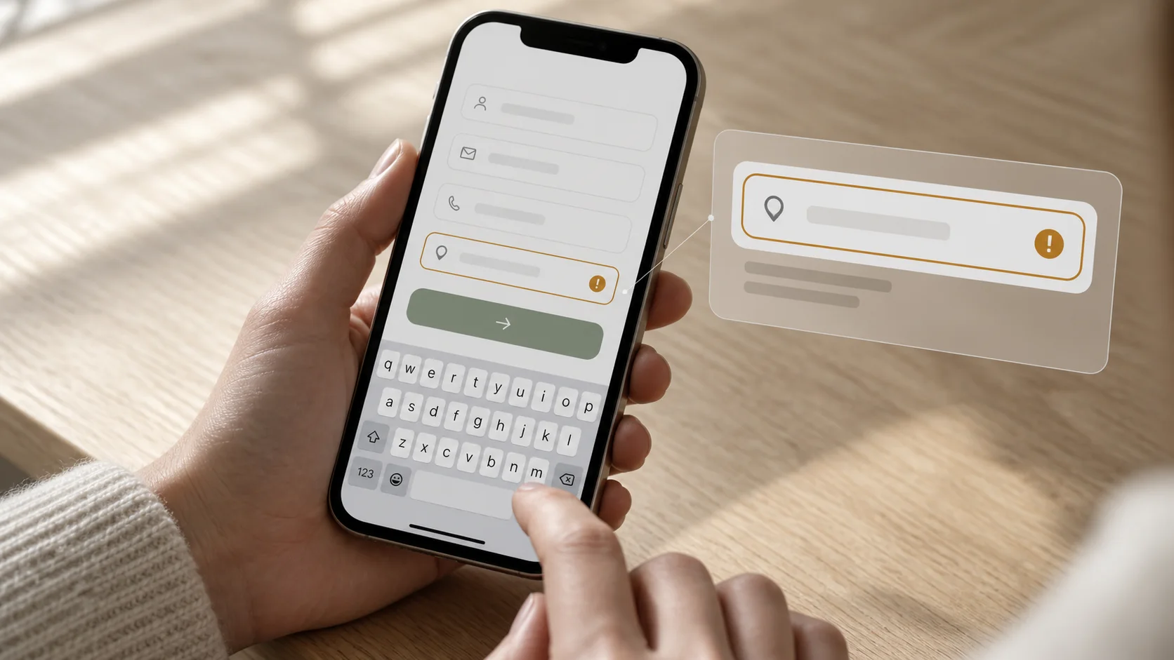
A page can fit a small screen and still be difficult to use. Test whether menus open reliably, overlays cover important actions, form errors remain visible, and the on-screen keyboard blocks the next step. Complete the whole journey on a real phone.
A lower mobile conversion rate alone does not prove poor UX; visitors may have different intentions or arrive through different channels. Look for a reproducible obstacle or repeated user difficulty before choosing a fix.
4. The Website Has Outgrown Its Structure
New services, campaigns, and product ranges can accumulate without a clear plan. Similar pages compete, navigation labels reflect internal departments, and customers must guess which route applies to them.
An audit should examine the path from a visitor's question to a relevant answer, including what happens after they follow the recommended link. Reviewing the homepage alone will miss problems deeper in the journey.
5. A Redesign Is Being Proposed Without a Diagnosis
“It feels dated” is a reason to discuss visual design, but it does not explain why customers struggle. Before approving a rebuild, identify which existing elements work, which fail, and whether the problems are local or structural.
An audit can support a narrower improvement plan or provide evidence for a wider redesign. Either outcome is useful when it gives your team a specific problem to solve.
When a Full Audit Is Not the First Step
If the site is unavailable, a payment fails consistently, or a contact form never delivers messages, fix the technical incident promptly. Document it for later review, but do not wait for a broad audit to restore a broken customer journey.
If visitors cannot find the website at all, investigate acquisition and search visibility. If the site works but the offer no longer fits customer needs, review positioning and demand. UX may be part of the answer, but an audit cannot create demand or guarantee more sales.
What Does the UX Audit Process Include?
Define the Audience, Task, and Scope
Choose a concrete journey, such as a prospective client comparing services and requesting a consultation. Agree on the entry pages, completion point, devices, and customer groups that matter. This makes the audit more useful than a general request to review every screen equally.
Prepare the website URL, business goals, known issues, recent changes, anonymized support examples, and available analytics. Provide test accounts where relevant; avoid putting real customer details into screenshots or shared recordings.
Review the Experience and Available Evidence
Walk through the chosen tasks and inspect navigation, page hierarchy, wording, feedback, forms, and error recovery. An expert review identifies likely usability problems; observing representative users attempting tasks helps test those assumptions. Nielsen Norman Group explains how heuristic evaluation complements usability testing.
Analytics can show where a journey changes or stops, but usually cannot explain the reason on its own. Where recordings are available, use appropriately configured collection and mask sensitive inputs. Agree separately whether user testing or additional research is included in the audit scope.
Check Accessibility and Technical Friction
Include basic checks for keyboard navigation, visible focus, form labels, readable contrast, and useful error messages. The W3C accessibility Easy Checks provide a starting point and make clear that a preliminary review is not a comprehensive accessibility evaluation.
Also note delays, layout movement, or failed interactions that interfere with the task. These findings may need development investigation alongside design changes. A visual review cannot establish the cause of every technical problem.
Separate Findings from Hypotheses
“The mobile menu cannot be closed using its visible control on this device” is an observed finding. “Visitors may misunderstand this label” is a hypothesis until supported by evidence. A useful report keeps that distinction visible so your team knows what to repair immediately and what to investigate.
How to Prioritize UX Fixes After the Audit

Prioritize each issue by the customer task it affects, the severity of the obstacle, how broadly it appears, and the confidence of the evidence. Then consider effort and dependencies with the people who will implement the work.
- Repair confirmed blockers: broken submissions, inaccessible controls, and interactions that prevent completion.
- Improve evidenced friction: confusing labels, unclear requirements, and errors that make people repeat work.
- Investigate uncertain changes: alternative layouts, new page structures, and ideas supported mainly by opinion.
For example, imagine a quote form clears all completed fields after a validation error. Record the affected URL and device, the steps to reproduce it, and the result. A practical recommendation is to preserve entered values and explain the error beside the relevant field. The acceptance check is to submit an invalid value, correct it, and confirm that the enquiry completes without re-entering everything.
This is an illustrative example, not a Zeroradius client result. The useful pattern is the connection between a visible problem, a specific fix, and a repeatable check.
What Should the Audit Deliver?
- A clear scope describing the journeys, devices, and evidence reviewed.
- A finding list with URLs, screenshots where useful, and reproduction steps.
- The customer and business consequence of each issue, with uncertainty stated.
- Recommended actions and an explained priority order.
- An implementation handoff with owners, dependencies, and acceptance checks.
Confirm which deliverables are included before commissioning the work. Zeroradius's UX audit service covers experience review, usability, user flows, analysis, and prioritized recommendations. If findings require revised interfaces, UI/UX design can provide the next design step.
Common Mistakes That Reduce the Value of an Audit
- Treating preferences as evidence: a stakeholder disliking a layout is different from a customer failing a task.
- Copying competitors without testing: their audience, offer, and business constraints may differ.
- Using a single metric as a verdict: a short visit can mean someone found a phone number quickly, not that the page failed.
- Reviewing only the successful path: include errors, empty results, back navigation, and confirmation states.
- Changing everything together: broad simultaneous changes make it harder to understand which fix helped.
- Stopping at the report: reserve implementation time and assign responsibility for checking the changes.
How to Know Whether the Fixes Worked
Start by repeating the original task and confirming that the identified obstacle is gone. Check nearby interactions for regressions, including mobile and keyboard use. For an enquiry journey, confirm both the on-screen success state and receipt of the enquiry.
Then compare relevant outcomes against a recorded baseline: completed tasks, form errors, qualified enquiries, and related support questions. Keep measurement definitions consistent and account for changes in traffic, campaigns, and seasonality.
Where traffic is limited, observed task completion and customer feedback can guide further improvements. Do not describe a small before-and-after difference as proof of a conversion uplift. Controlled experiments require enough suitable traffic and a planned measurement approach.
Find the Friction Before Choosing the Fix
A useful audit gives you a clearer decision: what is stopping customers, what evidence supports that conclusion, and what your team should address first.
Share your website, the journey you want customers to complete, and the problems you are seeing with Zeroradius. Request a UX audit to define the review scope and identify practical priorities for improving your existing website.
Have questions?
Look for repeated difficulty in important tasks, recurring customer questions, unexplained drop-off, or uncertainty before a redesign. Verify tracking and obvious technical faults first, then scope the audit around the journey that matters most.
An audit diagnoses usability problems and recommends priorities. A redesign changes the website's structure or presentation. An audit may recommend a few targeted repairs, a larger redesign, or additional research before deciding.
Yes. An expert review, support examples, and task-based sessions with representative users can reveal obstacles without a large analytics dataset. Limited traffic makes it harder to quantify the commercial effect of a change confidently.
Time and cost depend on the journeys, page types, device coverage, available evidence, and whether research is included. Ask for a scoped proposal with deliverables and implementation boundaries rather than comparing headline prices alone.
Do not assume implementation is included. Agree whether the engagement covers recommendations only, design revisions, development, and follow-up verification. The report should make the next actions clear regardless of who implements them.
Review key journeys after significant changes and when customer or performance signals suggest new friction. Choose the scope around what changed rather than commissioning the same full audit on an arbitrary schedule.