
An AI-generated Figma design can make a website feel ready long before it has been built. It may show a convincing desktop homepage, polished cards, and a neat visual system. It may not show how the layout behaves with a longer heading, a narrow phone, an empty result, a keyboard user, or an editor changing the content six months later.
To turn an AI-generated Figma design into a responsive website, review the design as a system first, define the real content and interaction states, translate repeated patterns into components, then test the working implementation across screen sizes and user journeys. This guide is for business owners and product teams preparing a generated design for an agency or development team.
Start by separating the design from the website
A Figma file can be an excellent specification, but it is not a production website. Frames show intended screens. Components can describe recurring patterns. Prototype links can illustrate a path. The finished site still needs semantic HTML, responsive rules, content models, performance choices, real integrations, error handling, and a deployment process.
Before estimating development, ask what the file actually contains. Is it one desktop concept, a full set of page templates, or a component library with documented states? Is the generated copy final? Are supplied images licensed and available at useful sizes? The answers affect the work more than the polish of the first frame.

Want a clearer user experience?
Improve the parts of your website users actually feel.
Get support with UX clarity, conversion flow, interface design, and website structure tailored to your goals.
Audit the Figma file before development starts
Give the development team access to the source file, not only a PDF or exported image. Review frames, page inventory, components, styles, assets, and prototype notes together. This exposes what can become a reusable system and what is still a one-off visual treatment.
- Page inventory: list every page, template, campaign page, legal page, and logged-in or transactional screen that is in scope.
- Components and variants: identify shared navigation, buttons, cards, forms, alerts, tables, filters, and footer patterns. Record hover, focus, disabled, loading, error, and empty states where they matter.
- Styles and tokens: reconcile colours, typography, spacing, radii, shadows, and breakpoints. If the file uses visually similar but inconsistent values, agree the production rules before coding.
- Assets and content: confirm image rights, source resolution, icons, fonts, videos, product data, and who owns final copy and translations.
- Interactions: clarify what is a visual cue and what must work, such as form validation, filtering, menus, accordions, carousels, search, or checkout.
Capture unanswered questions in a handoff log. A developer should not have to infer whether a card is clickable, whether a label can wrap, or what happens when an integration returns no data.
Design responsive behavior rather than shrinking the desktop frame
A responsive website is not a desktop layout scaled down. It is a set of rules that keeps hierarchy, controls, and content usable when space changes. Start with the information users need most, then decide what reflows, stacks, scrolls, collapses, or disappears at each breakpoint.
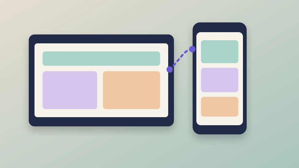
For each key template, include a realistic mobile frame and test it with the longest expected labels, real product or service names, variable image ratios, and form errors. Define how navigation changes, where utility actions move, how grids collapse, and whether data tables need a different mobile presentation. Avoid treating a single phone mockup as proof that every intermediate screen width works.
Typography needs the same care. A heading that looks balanced in a wide hero can create an oversized gap or push the primary action below the fold on a small screen. Set a readable type scale, usable line lengths, clear contrast, and spacing rules that can accommodate content changes.
Translate visual patterns into reusable components
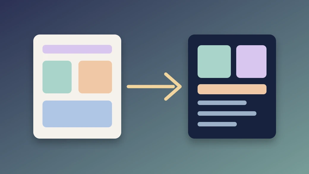
Production code should express the design system without making every page a custom exception. A card component, for example, might accept an image, label, title, supporting text, and optional action while keeping its spacing, focus state, and responsive behavior consistent. The goal is not to turn every rectangle into a component. It is to identify patterns that will be edited, repeated, or tested together.
Use the design file to agree component boundaries before the build. This makes reviews more useful: instead of asking whether ten cards look identical, the team can approve one component and validate it with several real content examples.
For a design that needs discovery, content hierarchy, and accessible interaction patterns before development, UI UX Design services can help turn rough generated output into an implementation-ready system. Keep the component list connected to the actual platform: a marketing site, CMS, Shopify theme, or custom application will have different editing and deployment needs.
Choose the platform around content and operations
Do not select a platform because a prototype was generated in a particular framework or because the Figma file uses a popular visual pattern. Start with the people who will operate the finished website. They may need to publish articles, update service pages, manage products, run campaigns, change navigation, or connect forms to a CRM.
- Content-led website: choose a CMS and content model that give editors safe control of the fields they own without exposing layout logic.
- Ecommerce store: map the design to product, collection, cart, account, and checkout capabilities before promising a custom interaction.
- Custom application: define the data, authentication, permissions, integrations, and error states before treating the front-end screens as complete.
When the starting point is a broader generated concept rather than a settled design file, our AI-generated design to production-ready website guide explains the wider audit, platform, and launch decisions. The important point is to make the content and operational model visible early, because it shapes the components that can be built responsibly.
Protect accessibility, performance, and visual fidelity together
Pixel accuracy is useful only when it does not make the site harder to use. During implementation, check heading structure, keyboard navigation, visible focus, labels, error messages, image alternatives, colour contrast, touch targets, motion preferences, and zoom. Test the design with actual content and assistive technology, not only a static overlay comparison.
Also decide which visual assets justify their loading cost. Export responsive image sizes, avoid unnecessary animation libraries, reserve space for media to reduce layout shift, and validate font loading. A page can resemble the Figma frame and still feel slow or unstable if its implementation choices have not been reviewed.
Use a practical design-to-development handoff checklist
- Provide editable Figma access, source assets, licences, final content where available, and a page inventory.
- Identify reusable components, their variants, and all meaningful loading, empty, error, hover, focus, and disabled states.
- Document responsive rules for navigation, grids, typography, images, forms, and data-heavy sections.
- Agree which fields editors can change and which layout decisions remain controlled by the design system.
- Map forms, analytics, integrations, ecommerce flows, permissions, and their failure messages.
- Test representative pages on mobile, tablet, and desktop with real content, keyboard navigation, and supported browsers.
- Use staging for stakeholder review, record acceptance criteria, and document ownership after launch.
Common mistakes include exporting a frame as an image instead of sharing the editable source, designing only the happy path, treating desktop as the source of truth for every device, and hiding required content inside an unmaintainable interaction. Resolve these issues in the design review, where they are cheaper and clearer to address.
Turn the approved design into a build plan
Bring the Figma file, page list, content responsibilities, integrations, and launch requirements into a focused review. Zeroradius can help shape the design system and implementation plan through its UI UX Design services, so the responsive website is practical for users, editors, and the team maintaining it. Start with the handoff checklist, then estimate the build against named components and real journeys rather than a single polished frame.
Have questions?
They can guide a faithful implementation, but an exact screenshot is not enough to define responsive rules, content variation, accessibility, or technical behavior. Review the system and states behind each visible screen before promising a result.
Share editable access, page inventory, components, styles, source assets, prototype notes, responsive frames, and a written list of required interactions. Include final or representative content so the implementation is tested against realistic conditions.
Not necessarily, but key templates and unusual sections need documented mobile behavior. Define repeatable responsive rules and show examples where the desktop layout could create ambiguity.
Choose the platform and content model around the people who will publish updates. Separate editable content from layout and code, then test the editing workflow with the actual business team before launch.
Redesign or refine it when it lacks a clear hierarchy, repeats inconsistent patterns, cannot accommodate real content, or leaves key interactions and mobile states unresolved. A focused design review can be more efficient than coding those uncertainties into the site.